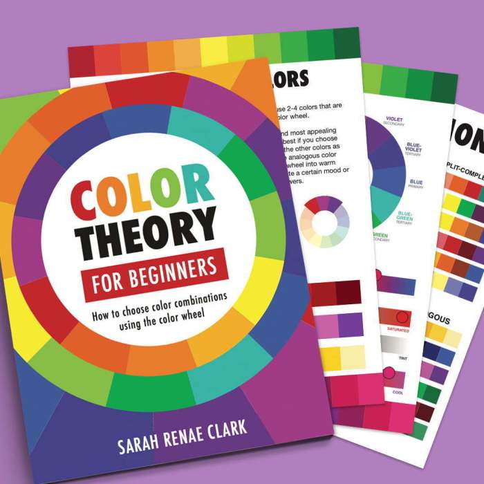
Embark on a vibrant journey into the world of Color Theory for Beginners, where you’ll discover the fundamentals of color and its profound impact on design, psychology, and everyday life.
From the intricacies of the color wheel to the emotional resonance of different hues, this guide unravels the secrets of color theory, empowering you to harness its transformative power in your creative endeavors.
Understanding Color Theory Basics
Color theory is a crucial aspect of design, as it helps us understand how colors interact and create visual effects. The color wheel serves as the foundation of color theory, representing the relationships between different colors.
The Color Wheel
The color wheel is a circular representation of colors, arranged based on their hues, saturation, and value. It consists of three primary colors (red, yellow, and blue), three secondary colors (green, orange, and purple), and six tertiary colors (combinations of primary and secondary colors).
Primary, Secondary, and Tertiary Colors
Primary colors are the most basic colors that cannot be created by mixing other colors. Secondary colors are created by mixing two primary colors, and tertiary colors are created by mixing a primary and a secondary color.
Color Harmonies
Color harmonies are combinations of colors that create pleasing visual effects. Some common color harmonies include:
- Complementary: Colors that are opposite each other on the color wheel (e.g., red and green).
- Analogous: Colors that are adjacent to each other on the color wheel (e.g., blue, blue-green, and green).
Color Psychology and Its Applications

Color psychology explores the emotional and behavioral effects of different colors. Understanding the impact of colors can be invaluable in branding, marketing, and design.
Influence on Emotions
- Red: Excitement, passion, danger
- Orange: Optimism, warmth, creativity
- Yellow: Happiness, cheerfulness, caution
- Green: Calmness, nature, growth
- Blue: Trustworthiness, stability, peace
- Purple: Luxury, sophistication, spirituality
Applications in Branding and Marketing
Colors play a crucial role in brand identity. For instance:
- McDonald’s: Red and yellow evoke hunger and excitement.
- Tiffany & Co.: Turquoise represents luxury and exclusivity.
Design Considerations
Color can enhance user experience in design:
- Contrast: Using contrasting colors improves readability and accessibility.
- Hierarchy: Color can create visual hierarchy, guiding the user’s attention.
- Emotion: Color can evoke emotions that align with the intended message.
Color Combinations and Schemes
Color combinations and schemes play a crucial role in design, influencing the overall mood, message, and impact of a project. Understanding how to effectively combine colors is essential for creating visually appealing and impactful designs.
When choosing color combinations, it’s important to consider the following factors:
- Color Wheel: The color wheel is a valuable tool for understanding color relationships and harmonies.
- Color Theory: Understanding the principles of color theory, such as complementary colors, analogous colors, and triadic colors, can guide your color choices.
- Context: Consider the purpose and context of your design project. Different color combinations may be appropriate for different industries or target audiences.
Popular Color Schemes
Here are some popular color schemes commonly used in design:
- Monochromatic: A monochromatic scheme uses variations of a single hue, creating a harmonious and elegant effect.
- Analogous: An analogous scheme uses colors that are adjacent to each other on the color wheel, resulting in a cohesive and pleasing look.
- Complementary: A complementary scheme uses colors that are opposite each other on the color wheel, creating a high-contrast and attention-grabbing effect.
- Triadic: A triadic scheme uses three colors that are evenly spaced around the color wheel, producing a vibrant and dynamic effect.
Choosing Colors for Specific Design Projects
To choose colors effectively for a specific design project, follow these steps:
- Define Your Goal: Determine the purpose and desired outcome of your design.
- Research Your Audience: Consider the demographics, preferences, and cultural influences of your target audience.
- Experiment with Color Combinations: Explore different color combinations using the color wheel and color theory principles.
- Get Feedback: Seek feedback from others to gain insights into the effectiveness of your color choices.
- Make Adjustments: Based on feedback and testing, make necessary adjustments to your color scheme to optimize its impact.
Color Theory in Streetwear Trends
Color plays a pivotal role in the vibrant and expressive world of streetwear fashion. Streetwear brands harness the power of color to create bold, eye-catching designs that reflect the culture and style of urban communities.
The Role of Color in Streetwear, Color theory for beginners
In streetwear, color serves multiple functions. It can:
- Convey brand identity and establish a recognizable aesthetic.
- Express personal style and individuality.
- Evoke emotions and create a desired mood.
- Influence consumer behavior and drive sales.
Color Usage in Streetwear Brands
Streetwear brands employ various color strategies to create unique and memorable designs. Some common techniques include:
- Monochromatic schemes: Using different shades of the same color to create a cohesive and sophisticated look.
- Complementary colors: Combining colors opposite each other on the color wheel for maximum contrast and impact.
- Analogous colors: Using colors adjacent to each other on the color wheel to create a harmonious and visually pleasing effect.
- Triadic colors: Combining three colors equally spaced around the color wheel for a bold and dynamic look.
Cultural and Social Significance of Color in Streetwear
Beyond its aesthetic appeal, color in streetwear also holds cultural and social significance. It can:
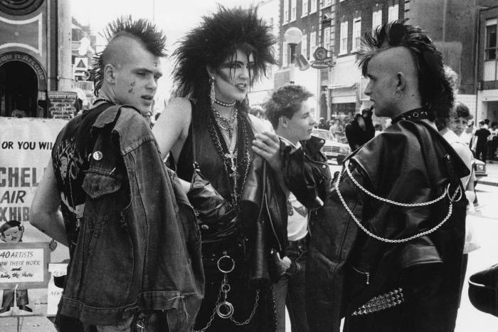
- Represent specific communities and subcultures.
- Express political or social messages.
- Reflect the wearer’s values and beliefs.
- Facilitate self-expression and creativity.
Advanced Color Theory Techniques
Delving into the intricacies of color theory, this section explores advanced concepts that empower designers and photographers to wield color as a transformative tool. By understanding color temperature, saturation, and value, one gains the ability to manipulate hues and create captivating effects that evoke specific moods and atmospheres.
Color Temperature
Color temperature refers to the warmth or coolness of a color, measured on a scale from warm (red, orange, yellow) to cool (blue, green, purple). Warm colors evoke a sense of energy, excitement, and passion, while cool colors convey tranquility, serenity, and aloofness.
Color theory for beginners provides a foundational understanding of the color wheel and how colors interact. It’s an essential concept for artists and designers. However, the principles of color theory can also be applied to other areas of life, such as the impact of color on our mental well-being.
As discussed in ” Benefits of Exercise for Mental Health “, exercise can have profound effects on our mood and cognitive function. Similarly, the colors we surround ourselves with can influence our emotions and perceptions. Understanding color theory for beginners can empower us to create environments that promote mental well-being and support our overall health.
In design, warm colors are often used to draw attention and create a sense of intimacy, while cool colors recede and create a more spacious feel. In photography, color temperature can be adjusted during post-processing to enhance the mood and atmosphere of an image.
Saturation
Saturation measures the intensity or purity of a color. Highly saturated colors are vivid and vibrant, while desaturated colors appear more muted and subdued. Increasing saturation can create a sense of boldness and drama, while decreasing it can result in a more subtle and sophisticated effect.
In design, saturation can be used to emphasize certain elements or create visual contrast. In photography, adjusting saturation can enhance the impact of colors or create a more realistic or dreamy look.
Value
Value refers to the lightness or darkness of a color. High-value colors are light and airy, while low-value colors are dark and somber. Value plays a crucial role in creating depth, contrast, and balance in design and photography.
In design, value can be used to create a sense of hierarchy, with lighter colors drawing attention and darker colors receding. In photography, value can be adjusted to control the exposure and mood of an image.
Understanding color theory for beginners can help you make informed decisions about your personal style and the colors that best complement your features. Just as colors can influence your mood and emotions, they can also impact your self-confidence and self-esteem.
Explore our article on How to Improve Self-Confidence and Self-Esteem to learn how to use colors to your advantage and enhance your overall well-being. By applying the principles of color theory, you can not only elevate your style but also boost your confidence and create a positive self-image.
Wrap-Up

As you delve into the depths of color theory, you’ll emerge with a newfound appreciation for the language of color. Whether you’re a budding designer, an aspiring artist, or simply curious about the world around you, this comprehensive guide will illuminate your path to mastering the art of color.
FAQ Explained: Color Theory For Beginners
What is the significance of the color wheel?
The color wheel is a fundamental tool in color theory, representing the relationships between different colors. It helps us understand how colors interact, create harmonies, and evoke emotions.
How does color psychology influence design?
Color psychology explores the emotional impact of colors, providing valuable insights for designers. By understanding how different colors affect mood, behavior, and perception, designers can create more effective and impactful designs.
What are some common color combinations and schemes?
Color combinations and schemes are essential for creating cohesive and visually appealing designs. Complementary, analogous, and monochromatic schemes are among the most popular, each with its unique aesthetic qualities.
How is color theory applied in streetwear fashion?
Streetwear brands leverage color theory to create bold, eye-catching designs that resonate with their target audience. Color plays a crucial role in expressing brand identity, cultural influences, and social messages.


