How to mix colors for painting: a journey into the vibrant realm of color theory, mixing techniques, and palette design. Discover the art of creating harmonious color combinations, achieving vibrant results, and unlocking the expressive power of color in your paintings.
From understanding the color wheel to mastering wet-on-wet and glazing techniques, this guide empowers you with the knowledge and skills to transform your canvas into a symphony of hues.
Color Theory Basics
Color theory is the study of how colors interact with each other and the visual effects they create. Understanding color theory is essential for painters, designers, and anyone working with colors.
The color wheel is a tool used to organize and visualize colors. It consists of 12 colors: three primary colors (red, yellow, and blue), three secondary colors (green, orange, and violet), and six tertiary colors (red-orange, red-violet, blue-violet, blue-green, yellow-green, and yellow-orange).
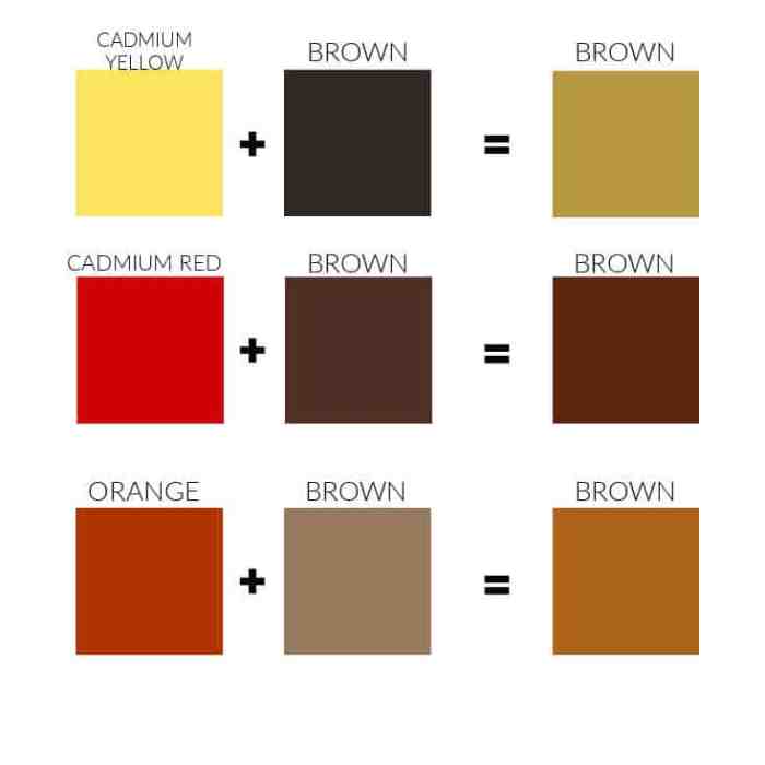
Primary colors cannot be created by mixing other colors. Secondary colors are created by mixing two primary colors. Tertiary colors are created by mixing a primary color with a secondary color.
Mixing colors for painting can be a relaxing hobby that encourages creativity and stress relief. However, if you’re struggling with sleep issues that hinder your painting sessions, consider exploring Ways to Improve Sleep Quality for Mental Health . A restful night’s sleep can boost your focus and enhance your ability to blend colors with precision, allowing you to fully immerse yourself in the therapeutic benefits of painting.
The color wheel can be used to create harmonious color combinations. Analogous colors are colors that are adjacent to each other on the color wheel. Complementary colors are colors that are opposite each other on the color wheel. Both analogous and complementary color schemes can create visually appealing results.
Warm and Cool Colors
Colors can also be classified as warm or cool. Warm colors include red, orange, and yellow. Cool colors include green, blue, and violet. Warm colors tend to advance in a painting, while cool colors tend to recede.
Understanding the basics of color theory can help you create more effective and visually appealing paintings.
Mixing Techniques: How To Mix Colors For Painting

Mixing colors is a fundamental aspect of painting, allowing artists to create a wide range of hues and shades. Various techniques can be employed to achieve different effects, each with its unique advantages and applications.
Wet-on-Wet Technique, How to mix colors for painting
This technique involves applying wet paint onto a wet surface, resulting in smooth transitions and soft blends. The paint’s fluidity allows it to flow and mix seamlessly, creating subtle gradients and ethereal effects. Wet-on-wet is particularly suitable for creating atmospheric landscapes, vibrant sunsets, and abstract compositions.
Wet-on-Dry Technique
Unlike wet-on-wet, this technique involves applying wet paint onto a dry surface. The paint tends to sit on top of the canvas, resulting in more defined brushstrokes and sharp edges. Wet-on-dry is commonly used for detailed work, such as portraits, still lifes, and precise rendering. It allows for greater control and accuracy in blending colors.
Glazing Technique
Glazing involves applying thin, transparent layers of paint over one another. Each layer allows the underlying colors to show through, creating depth and luminosity. Glazing is often used to enhance the richness and vibrancy of colors, particularly in oil painting. It allows artists to build up colors gradually, resulting in a luminous and multi-dimensional effect.
Tips for Mixing Colors
– Start with a limited palette: Restricting your color choices can help prevent muddy results and maintain color harmony.
– Mix in small increments: Adding too much of one color can quickly overpower the others. Gradually add small amounts until you achieve the desired hue.
– Use a color wheel: A color wheel can help you understand the relationships between colors and guide you in creating harmonious combinations.
– Experiment with different brushes: Different brushes can affect the blending and texture of mixed colors. Experiment with various shapes and sizes to find what works best for your technique.
– Avoid overmixing: Overmixing can lead to dull and lifeless colors. Mix just enough to achieve the desired consistency and hue.
Color Schemes
Color schemes play a crucial role in painting, influencing the overall mood and atmosphere of a work. Artists employ various color schemes to achieve specific visual effects and evoke emotions in viewers.
Common color schemes include:
Monochromatic
Monochromatic schemes utilize shades and tints of a single hue. This creates a cohesive and harmonious effect, often conveying a sense of unity and balance. Examples include Leonardo da Vinci’s “Mona Lisa” and Rembrandt’s “The Night Watch.”
In the realm of painting, mastering the art of mixing colors is a symphony of creativity. Just as the blending of hues creates captivating canvases, so too can blending insights and strategies help navigate the challenges of alcohol and drug addiction.
Tips to Manage Alcohol and Drug Addiction offers a wealth of knowledge and guidance to empower individuals on their path to recovery. By exploring these resources, we can enhance our understanding of color theory and the therapeutic power of self-discovery.
Analogous
Analogous schemes combine colors adjacent to each other on the color wheel. They share similar undertones and create a sense of harmony and flow. Examples include Vincent van Gogh’s “Starry Night” and Claude Monet’s “Impression, Sunrise.”
Complementary
Complementary schemes utilize colors opposite each other on the color wheel. This contrast creates a dynamic and visually striking effect, often evoking a sense of energy and excitement. Examples include Georges Seurat’s “A Sunday Afternoon on the Island of La Grande Jatte” and Wassily Kandinsky’s “Composition VII.”
Palette Design
A well-designed color palette is crucial for creating a cohesive and harmonious painting. It helps to establish the overall mood and atmosphere of the artwork.
When selecting a color palette, it’s essential to choose a limited number of colors that complement each other. A good rule of thumb is to use no more than 3-5 main colors, with additional accent colors for emphasis.
Organizing Paint Colors
To ensure easy access and organization, it’s recommended to store paint colors in a designated space. Consider using a palette box or a drawer specifically for paint tubes and brushes.
Arrange the colors in a logical order, such as by hue, value, or temperature. This will help you quickly find the desired colors while painting.
Closing Summary
As you delve into the world of color mixing, remember that experimentation and practice are key. Embrace the endless possibilities that color offers, and let your imagination soar. With each brushstroke, you’ll uncover new depths of expression and create artworks that captivate and inspire.
FAQ Corner
What is the color wheel?
The color wheel is a circular representation of colors, organized by their relationships to each other. It consists of primary, secondary, and tertiary colors, and serves as a valuable tool for understanding color combinations and harmonies.
How can I avoid muddy colors when mixing?
To avoid muddy colors, start with small amounts of paint and gradually add more until you achieve the desired shade. Use clean brushes and a white palette to prevent contamination. Additionally, consider using complementary colors to neutralize each other and create more vibrant results.
What is the difference between wet-on-wet and wet-on-dry techniques?
Wet-on-wet involves applying paint to a wet surface, allowing the colors to blend and flow together. Wet-on-dry, on the other hand, involves applying paint to a dry surface, resulting in more distinct and controlled color transitions.